1. Overview of the Dataset
The dataset used in this research is one of the largest and most comprehensive collections of climate change opinions expressed on Twitter. It spans from July 23, 2006 to October 1, 2019, includes over 15 million tweets, and covers various features such as geolocation, gender, sentiment, and stance on climate change. For more details, visit the Kaggle page.
Acknowledgement: This outstanding dataset had been extracted and processed by Dimitrios Effrosynidis and his team their paper is published here.
Key Dataset Features:
- Geolocation (latitude, longitude)
- User Gender
- Climate Change Stance (believer, denier, neutral)
- Sentiment Score (-1 to 1)
- Aggressiveness (aggressive language or not)
- Temperature Deviations (relative to 1951-1980 averages)
- Topic Modeling (10 topics such as emissions, human intervention, pollution, etc.)
The sampled dataset used in this study focuses on the U.S., containing 3.21 million tweets with an average sentiment of -0.025. Additionally, 53.3% of the tweets were classified as negative regarding climate change, with an average sentiment of -0.377.
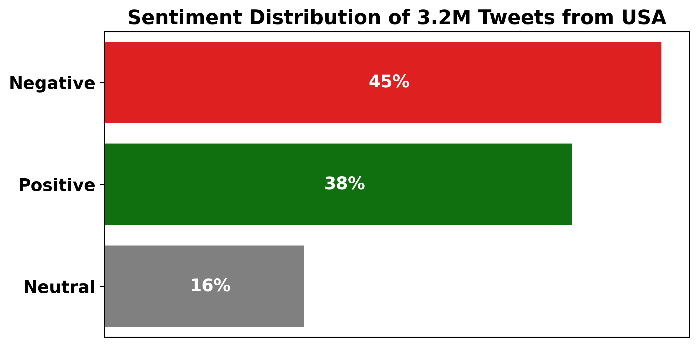
2. Sentiment Labeling and Distribution
To improve interpretability, we labeled sentiments as Positive(Sentiment Score more than +0.1), Negative(Sentiment Score less than -0.1), or Neutral(Sentiment Score between -0.1 and +0.1). The results show:
- 46.7% of the tweets are positive about climate change with an average sentiment of 0.378.
- 16.3% of the tweets are neutral.
- 45.5% of the tweets are negative with an average sentiment of -0.377.
The bar plot below visualizes the distribution of sentiment labels:
3. Stance and Sentiment: Understanding Climate Opinions
To explore the relationship between stance on climate change and sentiment, we examined sentiment distribution across different stances in our dataset, categorizing users as believers, deniers, or neutrals in terms of climate change. Results showed that climate change deniers exhibit a more pessimistic outlook overall, whereas believers, forming the majority of our dataset, tend to have mixed sentiments. Distribution findings reveal that believers constitute 73.7% of the population, neutrals make up 18.2%, and deniers account for 8.0%.
Sentiment distributions were visualized with two plots: a stacked bar plot representing sentiment labels within each stance, and a pie chart to highlight the proportion of each stance within the population.
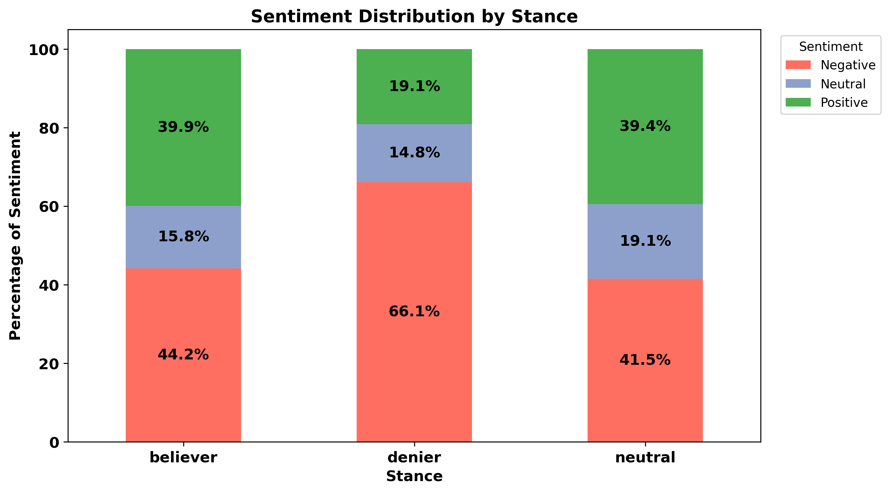
The stacked bar plot above shows the percentage of positive, neutral, and negative sentiment within each stance category. It indicates that deniers are predominantly negative, whereas believers and neutrals exhibit more balanced sentiment distributions.
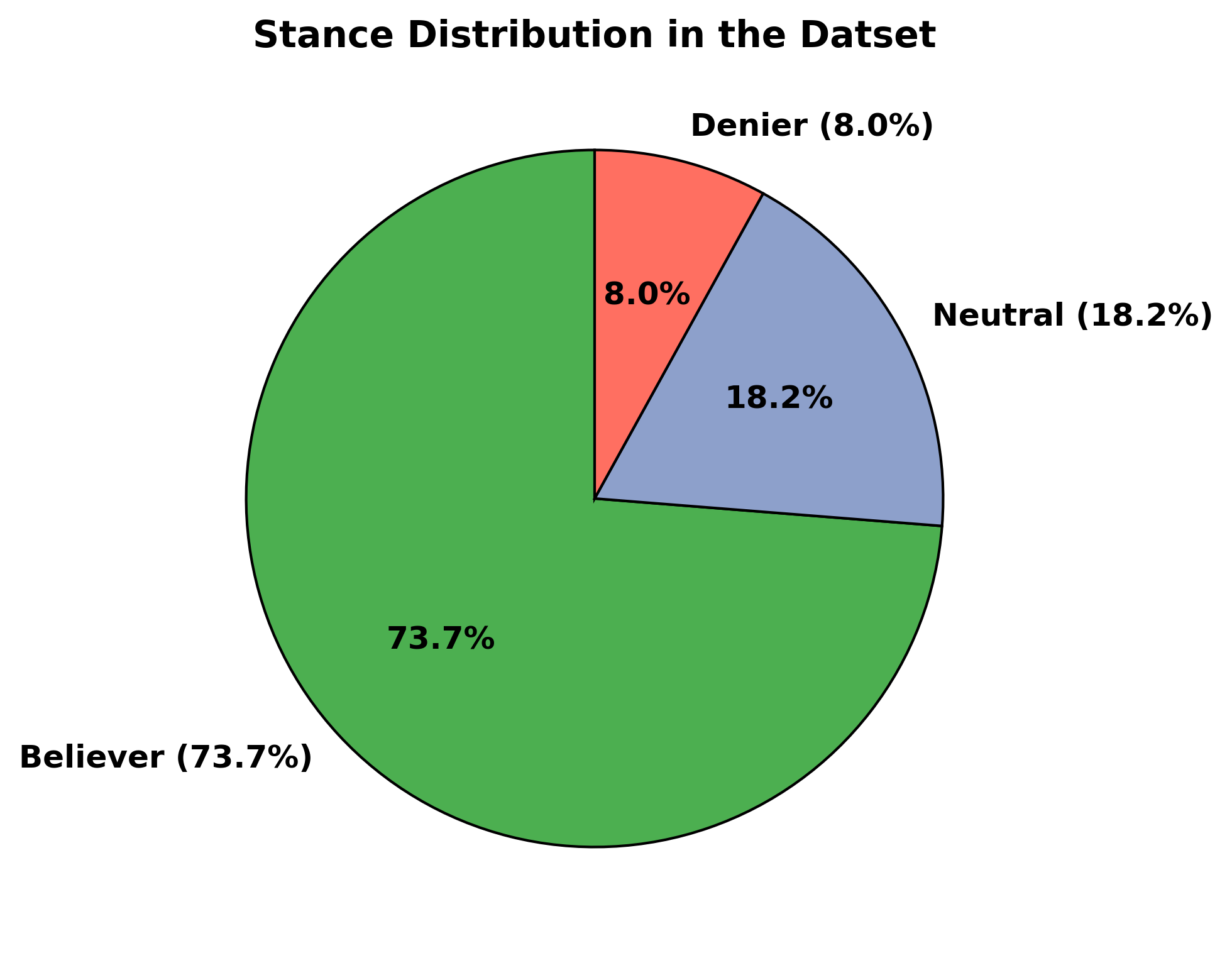
The pie chart displays the distribution of each stance category across the dataset, highlighting that the majority of users identify as believers, followed by neutrals and a smaller portion as deniers. These distributions provide insight into public sentiment and engagement on climate change topics.
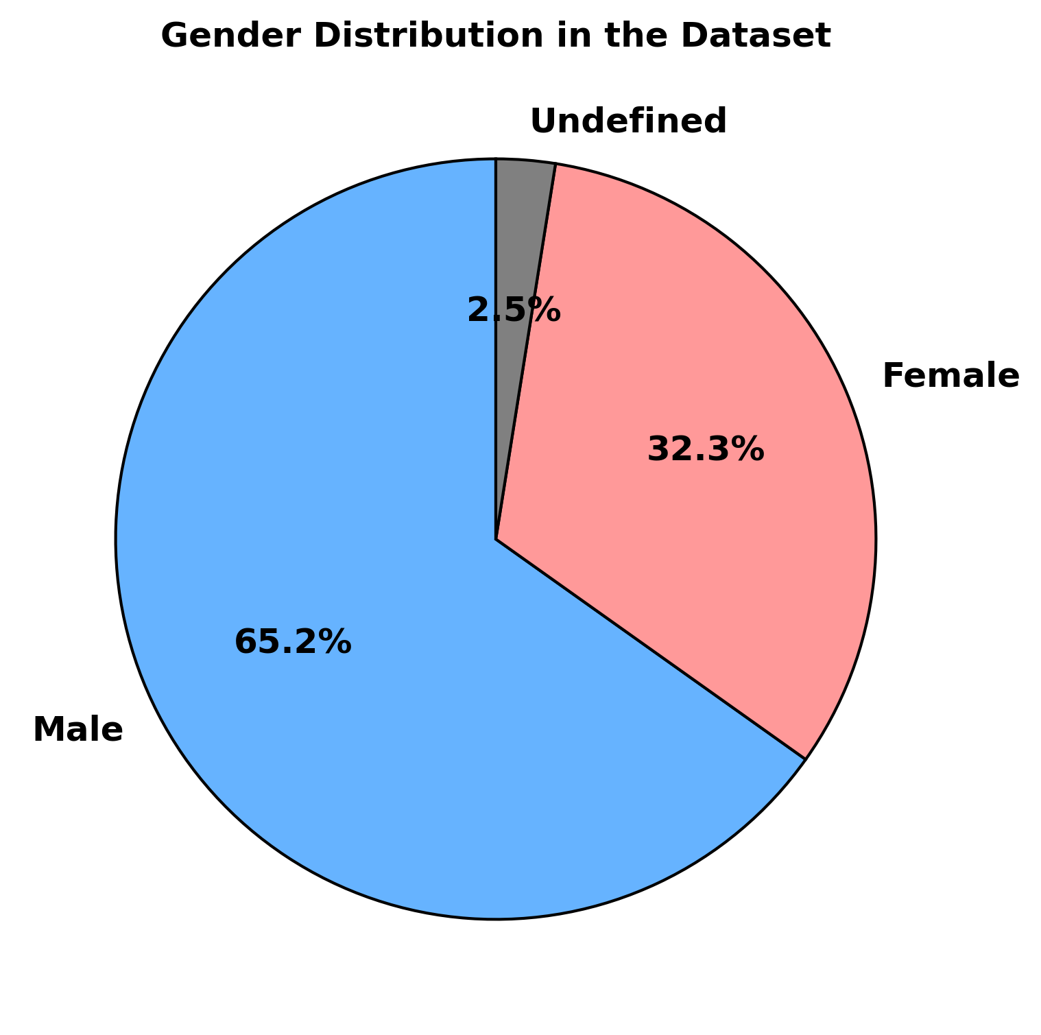
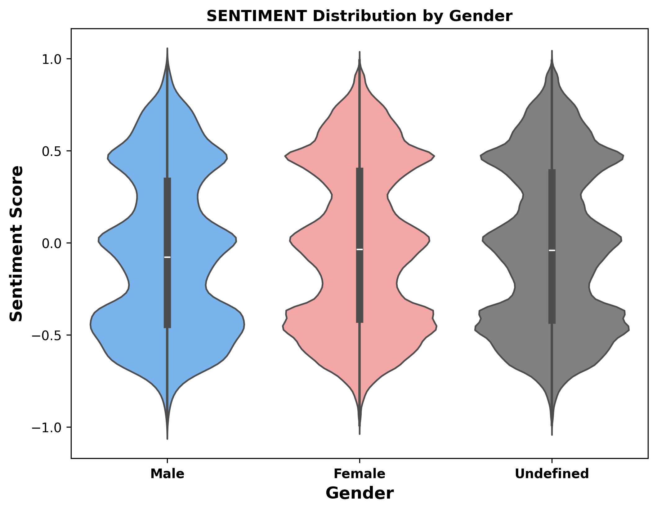
4. Sentiment and Gender Correlation
We analyzed how sentiment varies by gender and found the following distribution:
- 65.2% of the tweets were written by males.
- 32.3% of the tweets were written by females.
- 2.5% of the tweets have undefined gender information.
The following pie chart and violin plot show the sentiment distribution by gender:
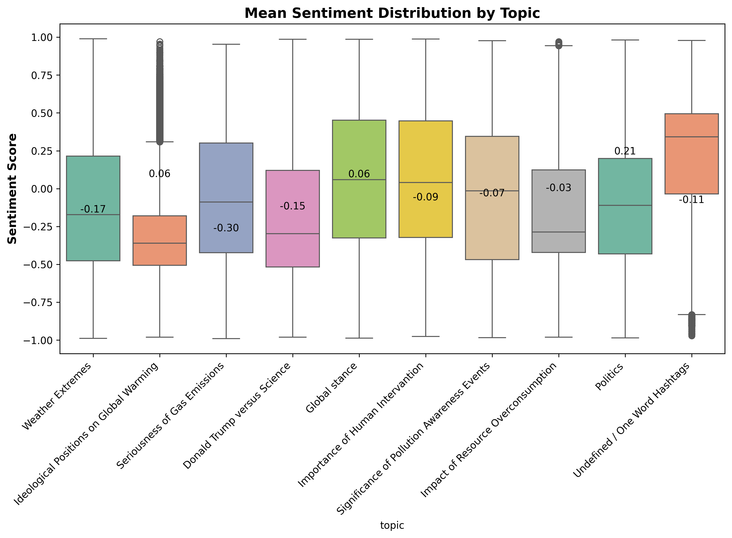
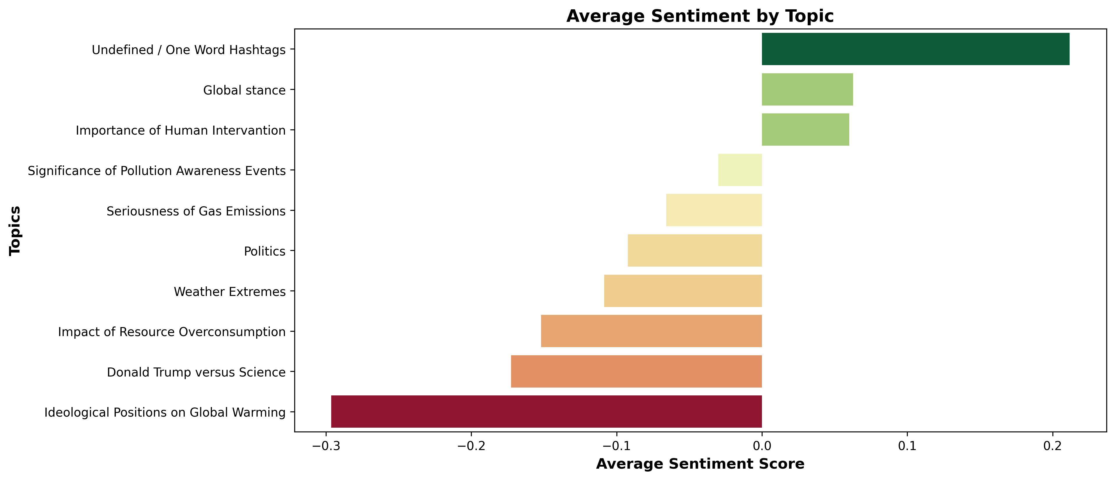
5. Topic-Based Sentiment Analysis
We also conducted a topic-based sentiment analysis, examining which topics elicited the most positive or negative sentiments:
- Global Stance was discussed in 25.8% of tweets.
- Weather Extremes appeared in 16.7% of tweets.
- Importance of Human Intervention was mentioned in 14.9% of tweets.
- Donald Trump vs Science made up 7.0% of tweets.
Below are visualizations of sentiment variation by topic:
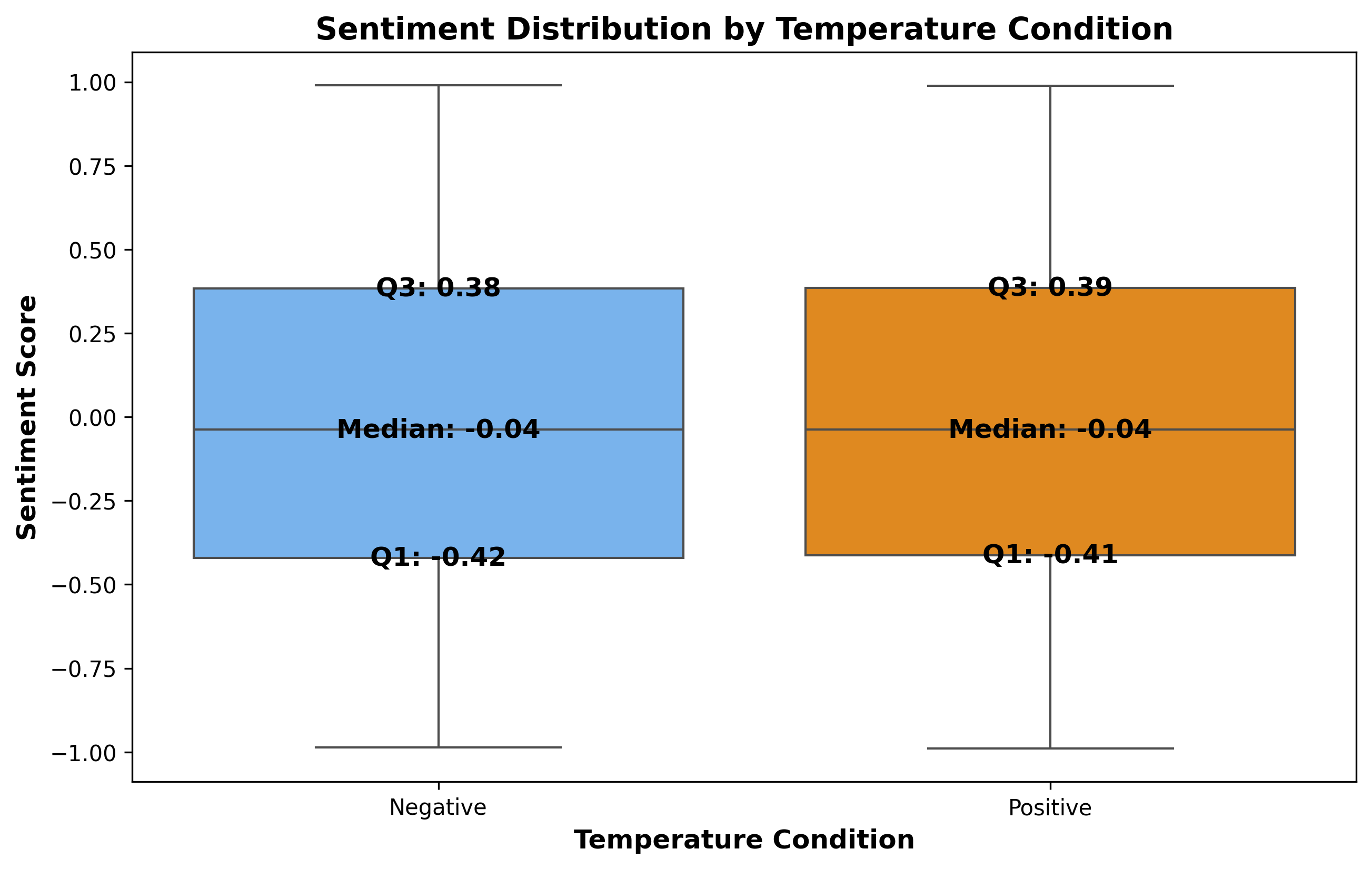
6. Minimal Impact of Temperature Deviations on Sentiment
About 64.89% of tweets were made during positive temperature deviations, while 34.99% occurred during negative deviations. Sentiment remains largely negative in both cases, with no significant difference based on temperature.
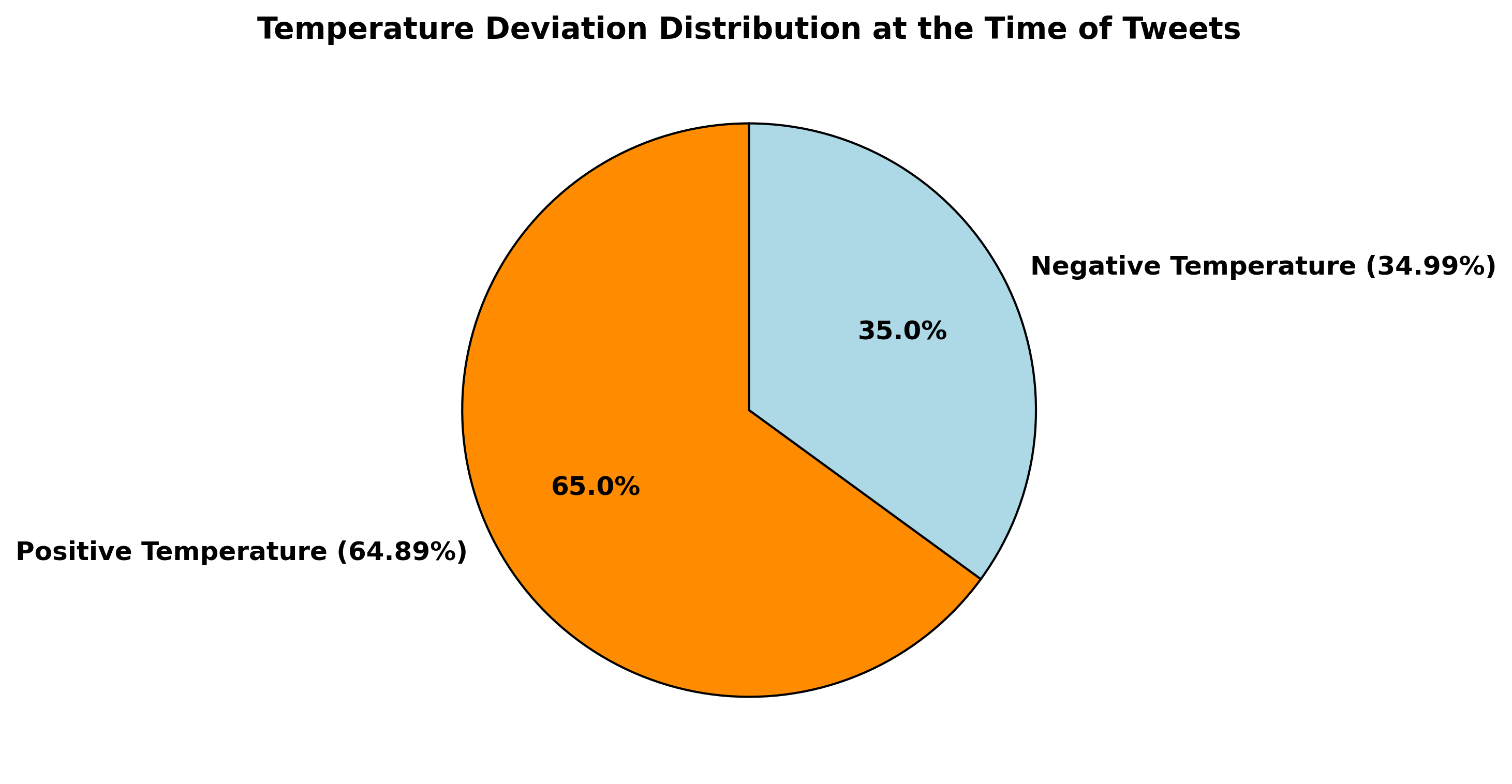
The analysis shows a very weak correlation between temperature deviations and sentiment, with an overall correlation of only 0.02. Positive deviations correlate at 0.008, and negative deviations at 0.057, indicating minimal influence.
Overall, temperature deviations do not significantly affect sentiment, as tweets on climate change tend to be negative regardless of the temperature conditions.
7. Aggressiveness Analysis
This analysis explores how sentiment is distributed between aggressive and non-aggressive tweets. It helps us understand if aggressive tweets tend to carry more negative sentiment or reveal any trends when comparing these two groups.
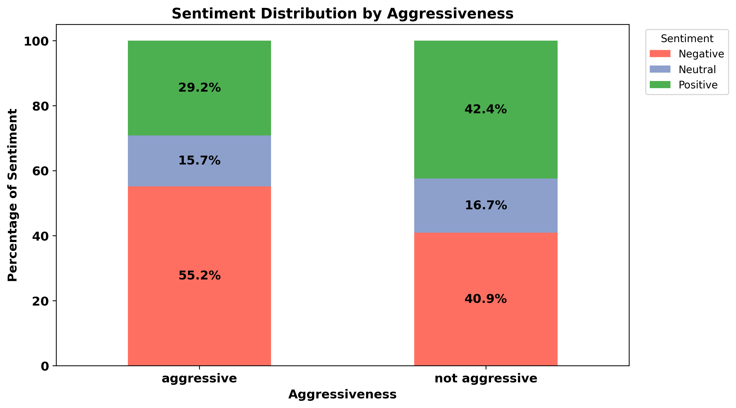
The distribution of sentiment is as follows:
- Aggressive Tweets: 55.15% Negative, 15.66% Neutral, 29.18% Positive.
- Non-Aggressive Tweets: 40.89% Negative, 16.67% Neutral, 42.43% Positive.
The data shows that aggressive tweets have a higher proportion of negative sentiment compared to non-aggressive tweets, which are more positive overall. Aggressive tweets tend to reflect a stronger emotional tone, particularly negative sentiment.
8. Temporal Analysis of Sentiment
This analysis examines how sentiment changes over time, identifying significant trends and patterns in the dataset of tweets gathered from 2006-07-23 to 2019-10-01. The average sentiment of tweets in this dataset is approximately -0.025.
8.1 Yearly Average Sentiment
The analysis of yearly average sentiment over the dataset reveals fluctuations in public sentiment regarding climate change:
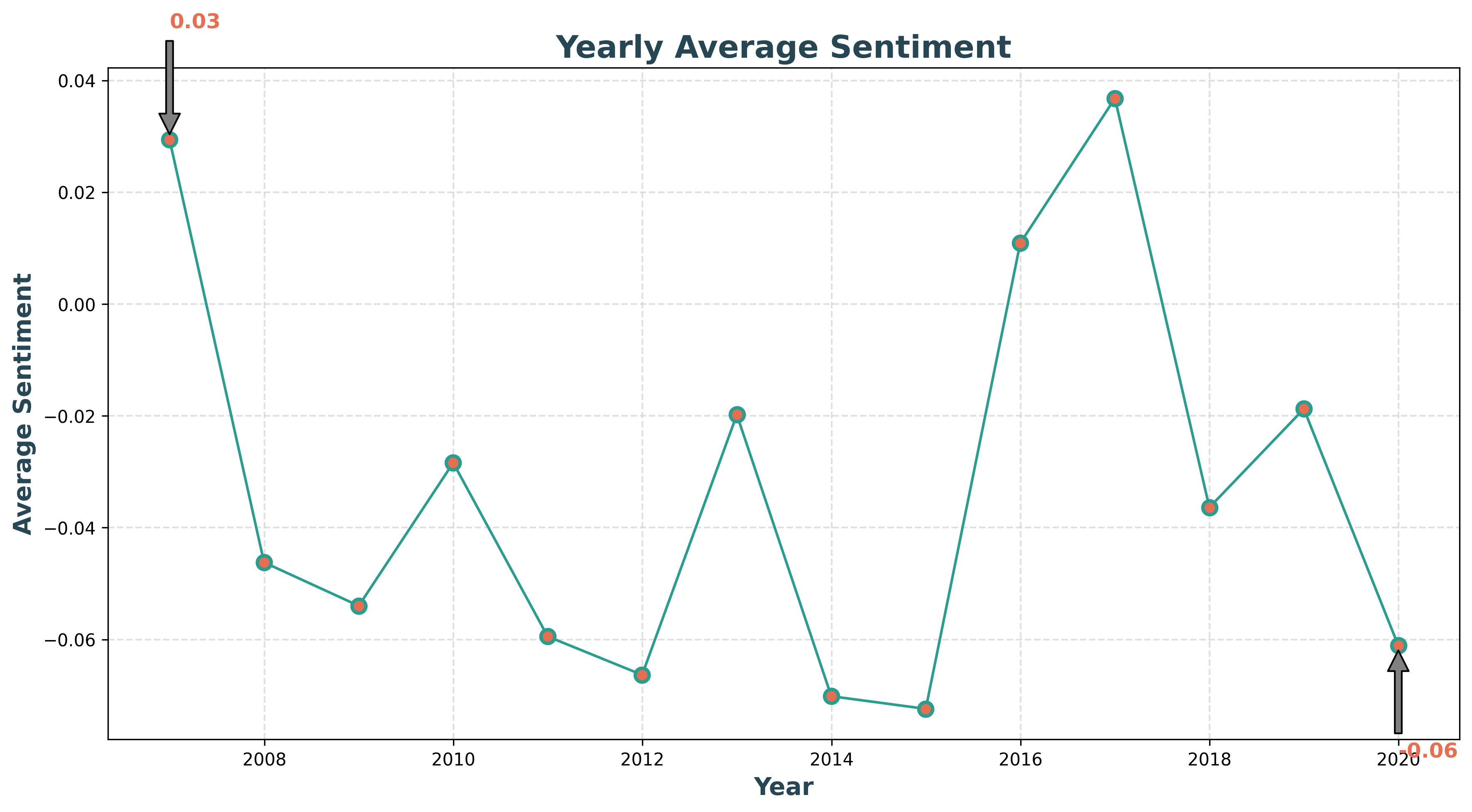
- Mean: 0.0293, indicating a slight positive sentiment overall.
- Median: -0.0462, suggesting a tendency towards negative sentiment in most years.
- Standard Deviation: 0.0340, demonstrating moderate variability in yearly sentiment.
- Minimum: -0.0724, reflecting the lowest sentiment recorded during a year.
- Maximum: 0.0368, highlighting the peak positive sentiment in any given year.
8.2 Monthly Average Sentiment
The monthly analysis provides a more granular view of sentiment variations:
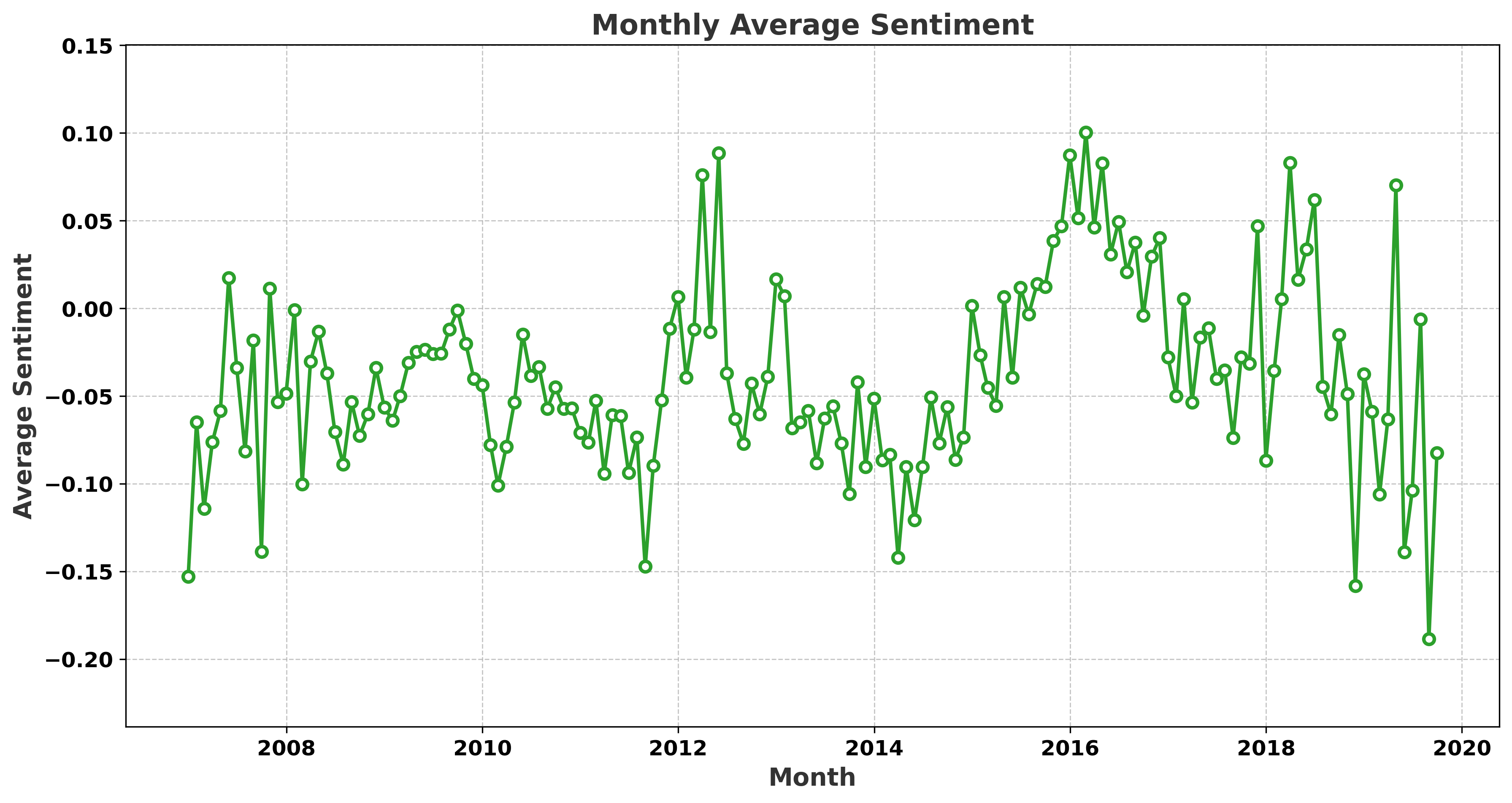
- Mean: -0.0386, indicating a generally negative sentiment across months.
- Median: -0.0448, reinforcing the trend of negative sentiment.
- Standard Deviation: 0.0527, suggesting that monthly sentiment scores exhibit moderate variability.
- Minimum: -0.1885, the lowest monthly sentiment observed.
- Maximum: 0.1003, showing the highest monthly sentiment peak.
8.3 Daily Average Sentiment
Daily sentiment analysis indicates the highest variability among the three temporal scales:
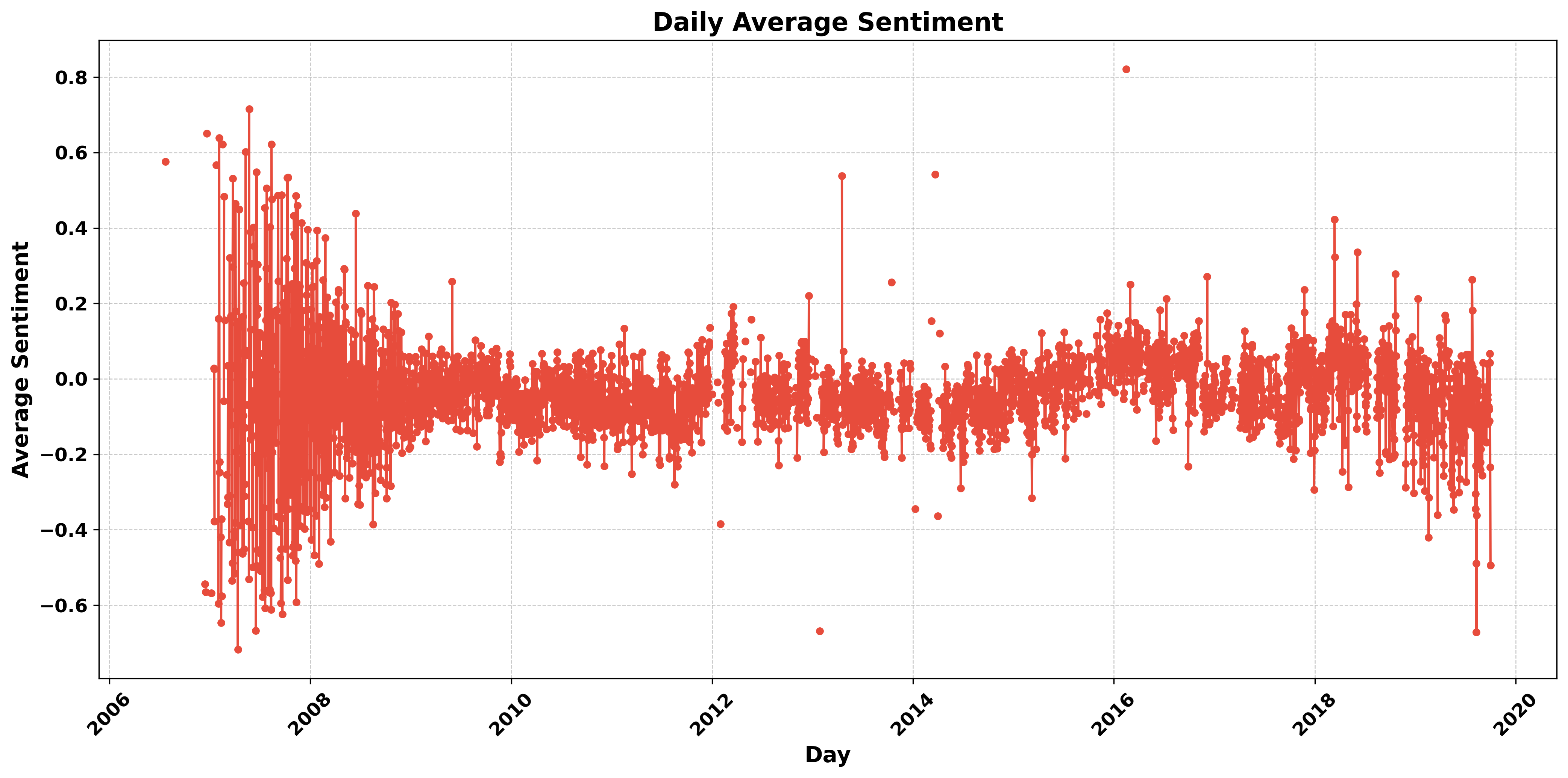
- Mean: -0.0387, indicating a slightly negative sentiment overall.
- Median: -0.0393, consistent with the mean sentiment.
- Standard Deviation: 0.1204, highlighting significant day-to-day fluctuations in sentiment.
- Minimum: -0.7171, capturing a day with particularly intense negative sentiment.
- Maximum: 0.8209, representing a day with exceptionally positive sentiment.
Conclusion:
Across all temporal analyses—daily, monthly, and yearly—the sentiment towards climate change tends to lean negative, with varying degrees of intensity and frequency. These insights can provide a deeper understanding of public perception and the emotional landscape surrounding climate change discussions.9. Geographical Distribution of 5.3 M Tweets From All Around the World, Over Years
The animated maps below visualize the Teperature Deviations and the Sentiment of Tweets regarding climate change over time, allowing for a dynamic view of how temperature and sentiment change geographically, all around the world.
View Animated Geographical Map of Temp Deviations View Animated Geographical Map of Sentiment10. Summary of Insights
This analysis of Twitter sentiment surrounding climate change indicates:
- A significant majority of users express negative sentiments toward climate change.
- Believers form the largest group, while deniers are the smallest.
- Gender differences exist in sentiment expression.
- Temperature deviations have a minimal effect on sentiment.
- Geographic location influences the intensity of discussions surrounding climate change.
In conclusion, this report provides valuable insights into the evolving landscape of climate change opinions on social media. Further studies could explore additional factors influencing public sentiment and engagement.